Harmony
Apple’s product design team is remarkable — I think you’d be hard pressed finding someone to dispute that. What makes Apple’s designers remarkable, is their ability to empathize with the consumer — or as Mike Markkula wrote in The Apple Marketing Philosphy:
Point No. 1: Empathy
Apple should strive for an “intimate” connection with customers’ feelings. “We will truly understand their needs better than any other company,” Markkula wrote.
Instead of cramming features into a device to feed the greedy consumer, Apple’s designers and engineers dig in deeper and go further than offering just veneer. They pay attention to how a device feels in your hand, how it feels in your pocket, or how it feels while resting on your bedside table at night.
When asked why I use an iPhone, I usually respond that it just “feels” right. I don’t know why that’s my response other than it’s always the first thing that comes to mind. I think most iPhone, iPad or Macbook users would understand my response without any further explanation. Intuitively, we understand that this “feeling” is really a collection of a bunch of really smart design decisions.
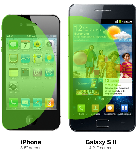
Dustin Curtis, recently wrote a popular post celebrating Apple’s design intuition. In the post, he describes specifically why cradling an iPhone vs. holding a Samsung Galaxy S II “feels different”. He writes:
Touching the upper right corner of the screen on the Galaxy S II using one hand, with its 4.27-inch screen, while you’re walking down the street looking at Google Maps, is extremely difficult and frustrating.
It was difficult and frustrating because you have to fumble with one hand to accomplish the full suite of everyday tasks. Dustin continues in his post to commend the Apple design team on their decision to build a 3.5” screen instead of a 4.21” screen. While most brands were thinking “bigger is better” when it came to screens, perhaps Apple understood the nuance from a deeper perspective of a more comprehensive understanding of the intersection of form & function.

When I look at these two phones though, I don't see the 180cm size difference, I see the residue of an entirely different hierarchy of design within the organization.
At Apple, designers are at the head of the table. Even though Jony Ive is soft spoken, Steve ensured that a holistic design process was paramount and perhaps the guiding factor of product design.
At Apple, it is the designers' world, and everybody else is just playing in it.
Contrast that with the role of the designer at Samsung, and I bet we get a much different perspective where the priorities of other departments (partnerships, finance, etc…) take a higher priority than the design department. Here’s a hypothetical conversation of how design works at Samsung:
Samsung Head of Partnerships Hey designer, we need to add this new feature into the OS because of the partnership we have with Fox, and it doesn't look good on a small screen.
Designer Hmmm...if we make the screen bigger it will cause other problems. I know videos will look better, but the phone won't be useable with one hand. Changing the screen would change the way apps are launched, our homescreen design, and navigation on every application...
Samsung Head of Partnerships Well, I'm sorry but I already got approval from the CEO — we have a big video partnership with Fox and Youtube for the product marketing push, and he says the screen has gotta be bigger for his demo at CES. We think we need to increase the size by 30%.
So you can see how a CEO’s hubris for a demo or a partnership might disrupt the product & design team by forcing them to adapt to other non-product oriented demands.
But maybe it’s not just partnership people throwing the designer off-track — I can almost hear the phone call between the designer and the director of finance sitting in his office 20 floors up:
Designer Argh...we can't fit this chip and the battery into their allocated space in the case — we need to talk to supply chain to order the smaller battery. I know it's more expensive, but the larger battery will affect the entire enclosure and changes the experience of every aspect of the device.
Finance Director Sorry, we can't get those smaller batteries, they don't fit into our cost models price.
Designer So what do I do?
Finance Chief Make the phone bigger? I don't know...but we can't afford the smaller batteries, sorry.
At Samsung, the design department isn't conducting the orchestra, they're just another one of the instruments.
The truth behind building something like the iPad or the iPhone is that there is considerably more than just design at play. There is, a harmony of all aspects of business: Finance, Internal Manufacturing, Supply Chain Management, Engineering, etc — It’s not “design” or the designers themselves, but where they fit into the corporate ecosystem that makes Apple remarkable.
Design is Apple’s foundation, and I’m sure many Apple designers go toe-to-toe with the Finance and Supply Chain guys to force the device to evolve the way they want it to evolve. But that doesn’t mean that designers at Samsung or other manufacturers don’t get it, it just means that at their companies, the hierarchy of internal departments is out-of-whack. Apple has — from day one — put its designers on a pedestal. More specifically, Steve Jobs put them on a pedestal. Design isn’t just built into the product it’s built into the whole freaking company.
Most businesses just aren’t structured this way. Usually, business are profit-first, not product-first. They’re usually run by people who want to build their bank accounts, not amazing products. Usually, the head of design hasn’t been knighted by the Queen of freakin’ England.
This harmony at Apple I’m sure didn’t come easily. But then again, Apple never really felt like a corporation, and Steve never felt like a “CEO”, at least, not to me. And that was also by design.
RIP Steve.
